Buy the Ticket, Take the Ride
Frank Stella: A Retrospective at the Whitney Museum of American Art
Each series of works has led to the next… seen in sequence, the progression is always apparent. No other American artist has traveled such tremendous distances in his work, and no artist’s future work is less predictable.[1]
– Calvin Tomkins
Protractor. Moby Dick. Scarlatti Sonata Kirkpatrick. These are just three of over twenty-five series represented in the first retrospective in almost thirty years of legendary New York based artist Frank Stella, which opened this fall at the new Whitney Museum of American Art in lower Manhattan. Organized by the Whitney’s Director, Adam D. Weinberg, and the Modern Art Museum of Fort Worth’s chief curator, Michael Auping, the exhibition presents a monographic overview of Stella’s six-decade career, spanning his participation in both Abstract Expressionism and Minimalism in the late 1950s, through his experiments with color, collage and sculptural form in the 1970s and 1980s, to his large scale steel structures of the present. The objective of this exhibition is to communicate the variety of work in Stella’s oeuvre, the development of his notion of “working space,” and his unique place in the history of art. [2] Although this Whitney space is still brand new to the art world, Frank Stella is anything but, and this is made ever more obvious through the explosion of shape, color, and form that have come to define Stella’s oeuvre, which are now contained within the Whitney’s walls. At times this exhibition feels like a roller coaster ride, and you might even come out of it with a sore neck from all the jerking around, however it is a fun ride that you definitely come out of feeling exhilarated. This essay seeks to unpack the jumbled chaos displayed in Frank Stella: A Retrospective, and to put into clear view the seemingly opposite ways in which Frank Stella repeatedly reinvented his style and consequentially redefined notions of beauty.
The exhibition begins as soon as the elevator doors open to the fifth floor of the Whitney, dramatically revealing the overwhelming presence of the “maximalist” Das Erdbeben in Chili [N#3] (1999) alongside the monochromatic Pratfall (1974) from the Benjamin Moore series [Fig 1].
The juxtaposition of these two pieces sets the tone for the rest of the exhibition. On the one hand there is a work from early in Stella’s career that is void of color and reduced to concentric lines, and on the other there is a larger-than-life size mural from later in his career, in bright fluorescent colors and incomprehensible shapes and imagery. This I consider to be the resting point for the exhibition, which begins and ends here. Beyond this wall lies a neck spraining and eye squinting plague of confusion as you try to separate and realign the tangled timeline of the artists’ career.
Moving past the entrance and into the first gallery the viewer is surrounded by the early artworks that launched Frank Stella’s career. Born in 1936 in Malden, Massachusetts, both of his parents painted at times. His mother had attended design school and often painted for pleasure, and his father was an occasional house painter, allowing Frank to participate in the preparation and paint application processes.[3] He attended the Phillips Academy in Andover, Massachusetts, where he developed a skill for painting and a working knowledge of the history of art including abstract expressionism. Afterwards he attended Princeton University, where he studied art history and continued to paint, though not for school credit. Immediately after graduating from Princeton in 1958 Stella moved to New York City and quickly found himself immersed in the world of abstraction that was dominating the art scene at the time.
With works like Die Fahne hoch!, this gallery represents his famous series of Black Paintings which he painted during his first year in the city [Fig 2]. A near instant success, Stella participated in Dorothy Miller’s Sixteen Americans exhibition at the Museum of Modern Art in 1959 where his Black Paintings caused quite the splash among critics and his contemporaries. Stella’s early exposure to house paint and its process had an obvious effect on his early career as it aided him in his venture to push illusionism out of the canvas and to refer back to the gesture of painting and simple design. In this he was simultaneously in step with Abstract Expressionists ideologies and Clement Greenberg’s ideas on modern painting, as with the concurrent quest of Minimalist art in creating an object that is neither painting nor sculpture.[4] The design for the Black Paintings was drawn from the physical form of the canvas’s stretcher bars and the brushstrokes from the width of the house painter’s brush that he used. The Black Paintings series blurred the line between the flat two-dimensional surface of the painting and the physicality of the three-dimensionality of a painting as an object.
Working with concentric lines as a “compositional unifier,” Stella developed a tool that he would use throughout his career to “explore the relationship between materiality, illusionistic space, and literal space”.[5] Michael Auping describes this idea in his essay for the exhibition catalog:
“The concept of a space within a space, often taking the form of a circular or concentric motion, would be a central theme running through his works over the following decades, as would his increasingly methodical investigation into the complexities of how we interpret a painted illusion that is also a painted object.”[6]
Furthering his exploration into a painting as an object and ideas of working space, as the viewer moves into the next gallery we find Stella carving away the canvas, leaving empty space where canvas once was, creating a shaped canvas. In Marquis de Portago (1960) we see the beginning stages of this elimination process [Fig 3]. As one turns the corner to enter another gallery the viewer sees three works from his Irregular Polygon series (1966), one from his Running V Paintings series (1964-65), all of which show the variety of shapes that Stella created with his canvases [Fig 4,5]. In this same room are four works from his Moby Dick series of the late 1980s, which jump off the wall with their massive scale and twisted, collaged multitude of parts, colors and patterns [Fig 6,7].
This room is the first moment in which the viewer might feel confused, overwhelmed. It is here that I first felt a strain in my neck, looking back and forth from one end of the gallery to the next, trying to understand what might have happened within those twenty years that would lead from a shaped canvas that resembles a missing puzzle piece to a wild and dreamlike wall relief that looked as though it had fallen off of a theme park ride. In fact, I felt as if I had just experienced the first few seconds of a rollercoaster that goes from zero to 100 in a matter of seconds. As Robert Rosenblum states in the introduction for Lawrence Rubin’s Catalogue Raisonné on Stella, when thinking about his early works and his later works, Stella seems to move “from monkish austerity to juke-box extravaganza,” and it is in this room that the viewer gets their first dose of this massive transformation.[7] Here the concentric lines are transformed into shapes, and then into forms of madness, toying with the materials and notions of shape and form in space.
The rest of the exhibition looks just like this. Works placed next to each other are two and three decades apart, and the viewer is left without a guide to understand the relationship between them. According to Roberta Smith in her New York Times review of the exhibition, this disorganized mode of display was intended “to create stimulating clashes of color, form and process.”[8] While this is accomplished, it is a purely aesthetic experience and leaves one feeling as though they are at some defunct carnival rather than a retrospective. It takes a great effort on the part of the viewer to piece together the seemingly unrelated works of art on the walls. I agree with Smith, who suggested that “an illustrated guide delineating Mr. Stella’s actual chronological development would help everyone comprehend the rearranged one in the galleries.”[9] Although I found this to be exhausting and unnecessary, I was drawn into the work more than I might have been had all the information been handed to me. It wasn’t until I saw Stella’s works from the 1970s such as Grajau I (1975) and Eskimo Curlew (1976) that I was able to make sense of what I had seen in the previous galleries and began to piece together his career and process [Figs 8,9]. While viewing these works I was able to make the connection from the Copper and Aluminum series that transition through the Running V series to the Polygon works. And from the polygon works I was brought to my present place in his timeline – the work had to come farther off of the wall.
The remaining galleries are full of more works from his Moby Dick and some from the Protractor series, as well as large collage-like murals, all done with the assistance of the computer [Fig 10]. It is all pretty wild, until you reach the final gallery overlooking the Hudson River. Here we enter what feels like a post-apocalyptic world, where the sculptures from the rooms before are now singed, stripped of color, and arranged in even wilder formations. The roller coaster is over, and there is a great feeling of calmness in this gallery. There is also a large couch here allowing the viewer to sit for a moment and contemplate what has just happened to them in the previous hour or so. Or, maybe just to sit and admire Stella’s aluminum and steel sculptures from the 1990s and early 2000s [Fig 11]. Perhaps this tranquility has something to do with the Raft of the Medusa (Part I) (1990), offering hope for an end to the madness – we are almost off of the rollercoaster.
Clashes of color, form and process are indeed the theme of this exhibition.[10] While there is a small section devoted to some of Stella’s drawings, I feel that it would have been helpful for some of his early paintings from his time at Princeton and the Phillips Academy in Andover to be on display, or works by artists who had a profound influence on this style such as Hans Hoffmann and Robert Motherwell, offering insight to a more fully developed idea of Frank Stella. I feel that his earlier works show a real connection to his later works. As Michael Auping states in the exhibition catalog, “these work s are fundamentally not that far from Stella’s earliest visions of abstract painting, when he was a student negotiating the physical and complex spatial dynamics of a picture plane.”[11]
As the viewer wraps around to the last corner to return to the “resting place,” there is a small quaint room full of just a few works from Stella’s Scarlatti Sonata Kirkpatrick series, which I found very charming and seem to be a complete mesh of his entire body of work. Within K.81 combo (K.37 and K.43) large size (2009) are held all the pieces from each work before in this exhibition: concentric lines, clashes of color, empty spaces and angular shapes, and abstract geometric forms breaking off the wall [Fig 12]. This for me was a great ending to the exhibition. It was here in front of these perfect gems that I saw how everything came together. This exhibition wasn’t just a rollercoaster - it was an experience. In a 1984 profile piece in the New Yorker, Calvin Tomkins quotes Stella, who inserts himself undeniably into the art of the abstract, stating that his career was “determined by the fact that I was born in 1936.”[12] Due to the dominant force of abstract art in the world around him at the time, he immediately belonged to it and has “never attempted or been seriously pressed to paint any other way.”[13] It is through abstraction that Stella has managed to transform how he represents beauty and in turn how we view it. And although this exhibition was extremely chaotic and unfamiliar, I don’t think that it could have been done any other way. It is an experience to be had by all. Buy the ticket, take the ride.[14]
[1] Calvin Tomkins, “The Space Around Real Things,” New Yorker (September 10, 1984), 54.
[2] Marla Price and Adam D. Weinberg, “Foreword” in Frank Stella: A Retrospective (New Haven: Yale University Press, 2015), viii.
[3] Adam D. Weinberg, “The End Depends Upon the Beginning,” in Frank Stella, A Retrospective, (New Haven: Yale University Press, 2015), 1.
[4] James Meyer, “Specific Objects,” in Minimalism: Art and Polemics in the Sixties, (New Haven: Yale University Press, 2001), 134.
[5] Michael Auping, “The Phenomenology of Frank/’Materiality and Gesture Make Space,’” 18.
[6] Michael Auping, “The Phenomenology of Frank/’Materiality and Gesture Make Space,’” 15.
[7] Robert Rosenblum, Introduction to Frank Stella: A Catalogue Raisonné (New York: Stewaét, Tabori & Chang, 1986), 10.
[8] Roberta Smith, “Tracking Frank Stella’s Restless Migrations (From Painting and Beyond),” The New York Times, October 29, 2015 (http://www.nytimes.com/2015/10/30/arts/design/tracking-frank-stellas-restless-migrations-from-painting-and-beyond.html?_r=0). Accessed November 17, 2015.
[9] Roberta Smith, “Tracking Frank Stella’s Restless Migrations (From Painting and Beyond)”, The New York Times.
[10] Roberta Smith, “Tracking Frank Stella’s Restless Migrations (From Painting and Beyond)”, The New York Times.
[11] Michael Auping, “The Phenomenology of Frank/’Materiality and Gesture Make Space,’ “ in Frank Stella: A Retrospective (New Haven: Yale University Press, 2015), 15.
[12] Calvin Tomkins, “The Space Around Real Things,” 57.
[13] Calvin Tomkins, “The Space Around Real Things,” 57.
[14] From Hunter S. Thompson’s Fear and Loathing in Las Vegas and also the title of a documentary film about the writer. Refers to being in a chaotic situation and choosing to move forward instead of turning back.
SOURCES
Auping, Michael. Frank Stella: A Retrospective. New Haven: Yale University Press, 2015.
Auping, Michael. “The Phenomenology of Frank/’Materiality and Gesture Make Space,’ “ in Frank Stella: A Retrospective. New Haven: Yale University Press, 2015. pp.15-39.
Binlot, Ann. “Interstellar: Whitney museum toasts Frank Stella with a retrospective.” Wallpaper, October 29, 2015, (http://www.wallpaper.com/art/interstellr-a-retrospective-of-frank-stellas-iconic-works-opens-at-the-whitney-in-new-york). Accessed November 17, 2015.
Bröker, Holger, Markus Brüderlin, Gregor Stemmrich, Frank Stella. Frank Stella: The Retrospective Works 1958-2012. Ostfildern: Hatje Cantz, 2012.
Crook, Jo and T. Learner. The Impact of Modern Paints. New York: Watson-Guptill, 2000.
Davis, Ben. “Frank Stella at the Whitney Is All Style, No Substance.” Art Net news, November 3, 2015, (https://news.artnet.com/art-world/frank-stella-whitney-retrospective-review-354794). Accessed November 17, 2015.
Farago, Jason. “Frank Stella at the Whitney from impassive abstraction to riotous baroque.” The Guardian, October 29, 2015, (http://www.theguardian.com/artanddesign/2015/oct/29/frank-stella- retrospective-whitney-museum-new-york. Accessed November 17, 2015.
Goldberger, Paul. Frank Stella: Painting into Architecture. New York: Metropolitan Museum of Art, 2007.
Guberman, Sidney. Frank Stella: An Illustrated Biography. New York: Rizzoli, 1995.
Hobbs, Robert, Tom Hunt, Frank Stella, Karen Wilkin. Frank Stella: Connections, ed. Ben Tufnell. Ostfildern: Hatje Cantz, 2011.
Meyer, James. “Specific Objects,” in Minimalism: Art and Polemics in the Sixties. New Haven: Yale University Press, 2001. pp.134-141.
Micchelli, Thomas. “Something Worth Arguing About: Frank Stella Fills the Whitney.” Hyperallergic, October 31, 2015, (http://hyperallergic.com/249710/something-worth-arguing-about-frank-stella-fills-the-whitney/). Accessed November 17, 2015.
Price, Marla and Adam D. Weinberg. “Foreword” in Frank Stella: A Retrospective.New Haven: Yale University Press, 2015.
Rosenblum, Robert. Introduction to Frank Stella: A Catalogue Raisonné. New York: Stewaét, Tabori & Chang, 1986. pp.10-23.
Rubin, Lawrence. Frank Stella: A Catalogue Raisonné. New York: Stewaét, Tabori & Chang, 1986.
Rubin, William. Frank Stella. New York: MoMA, 1970.
Rubin, William. Frank Stella: 1970-1987. New York: MoMA, 1987.
Saltz, Jerry. “Toward a Unified Theory of Frank Stella.” Vulture, October 30, 2015, (http://www.vulture.com/2015/10/toward-a-unified-theory-of-frank-stella.html). Accessed November 17, 2015.
Schjeldahl, Peter. “Big Ideas: A Frank Stella retrospective.” The New Yorker, November 9, 2015, (http://www.newyorker.com/magazine/2015/11/09/big-ideas-the-art-world-peter-schjeldahl). Accessed November 17, 2015.
Smith, Roberta. “Tracking Frank Stella’s Restless Migrations (From Painting and Beyond).” The New York Times, October 29, 2015, (http://www.nytimes.com/2015/10/30/arts/design/tracking-frank-stellas-restless-migrations-from-painting-and-beyond.html?_r=0). Accessed November 17, 2015.
Stella, Frank. Frank Stella: black and metallic paintings: 1959-1964. New York: Gagosian Gallery, 1990.
Tomkins, Calvin. “The Space Around Real Things.” New Yorker. September 10, 1984. pp. 53-97
Weinberg, Adam D. “The End Depends Upon the Beginning,” in Frank Stella: A Retrospective. New Haven: Yale University Press, 2015.
Woodward, Richard B. “‘Frank Stella: A Retrospective’ Review.” The Wall StreetJournal, November 2, 2015, (http://www.wsj.com/articles/frank-stella-a-retrospective-review-1446503446). Accessed November 17, 2015.
--The Editors of ARTnews. “’His ability to change has been amazing’: A review of MoMA’s Frank Stella Survey, from 1970.” ARTnews, October 30, 2015, (http://www.artnews.com/2015/10/30/his-ability-to-change-has-been- amazing-a-review-of-momas-frank-stella-survey-from-1970/). Accessed November 17, 2015.
![Figure 1: View of entrance to the Whitney Museum of American Art’s 5th floor installation of “Frank Stella: A Retrospective.” Depicted is the exhibition’s introductory wall text along side Das Erdbeben in Chili [N#3] (1999) and Pratfall (1974).](https://images.squarespace-cdn.com/content/v1/589de365e58c62750d5e7864/1501014015676-QYIVCUAXPBM7FQRHYC3O/image-asset.jpeg)
Figure 1: View of entrance to the Whitney Museum of American Art’s 5th floor installation of “Frank Stella: A Retrospective.” Depicted is the exhibition’s introductory wall text along side Das Erdbeben in Chili [N#3] (1999) and Pratfall (1974).

Figure 2: Die Fahne hoch!, 1959
Enamel on canvas
121 1/2 x 73 inches (308.6 x 185.4 cm)

Figure 3: Marquis de Portago, 1960
Aluminum oil paint on canvas
93.13 x 71.38 inches (236.55 x 181.3 cm)
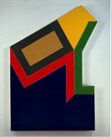
Figure 4: Moultonville II, 1996
Fluorescent alkyd and epoxy paint on canvas
124 x 86 x 4 inches (315 x 218.4 x 10.2 cm)

Figure 5: De la nada vida a la nada muerte, 1965
Metallic powder in polymer emulsion on canvas
81 x 293 inches (205.74 x 744.22 cm)

Figure 6: The Whiteness of the Whale (IRS-I, 2X), 1987
Paint on aluminum
149 x 120.75 x 45.25 inches (378.46 x 306.7 x 114.94 cm)

Figure 7: Installation view of two works from Irregular Polygon series flanked on both sides by four works from Moby Dick series.
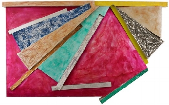
Figure 8: Grajau I, 1975
Paint and lacquer on aluminum
82 x 132 inches (208.3 x 335.3 cm)

Figure 9: Eskimo Curlew, 1976
Litho crayon, etching, lacquer, ink, glass, acrylic paint and oilstick on aluminum
96 x 2 3/4 x 127 inches (243.84 x 6.98 x 322.58 cm)

Figure 10: Installation view of Frank Stella: A Retrospective

Figure 11: Installation view of Frank Stella: A Retrospective

Figure 12: K.81 combo (K.37 and K.43) large size, 2009
Protogen RPT with stainless steel tubing
180 x 192 x 120 inches (457.2 x 487.7 x 304.8 cm)